Charts and Visualisations in Excel
Excel provides a host of charts and visualisations to tell stories data. Explore the basics of creating charts in Excel and what makes a good chart. And discover how to use a range of less common Excel charts for maximising the effectiveness of your data visualisations.
£100 +VAT

Charts and Visualisations in Excel
£100 +VAT
Charts and Visualisations in Excel
This course is not currently available. To find out more, please get in touch.
This course will enable you to
- Tell a compelling story with your data by inserting, amending and formatting charts in Excel
- Use a wide range of charts including some less well known ones like bubble charts, box and whisker charts, waterfall charts, heat maps and stock charts
- Know the difference between good and bad charts and apply best practice to creating data visualisations
- Understand the different Excel formatting options and create an effective common chart for your data
About the course
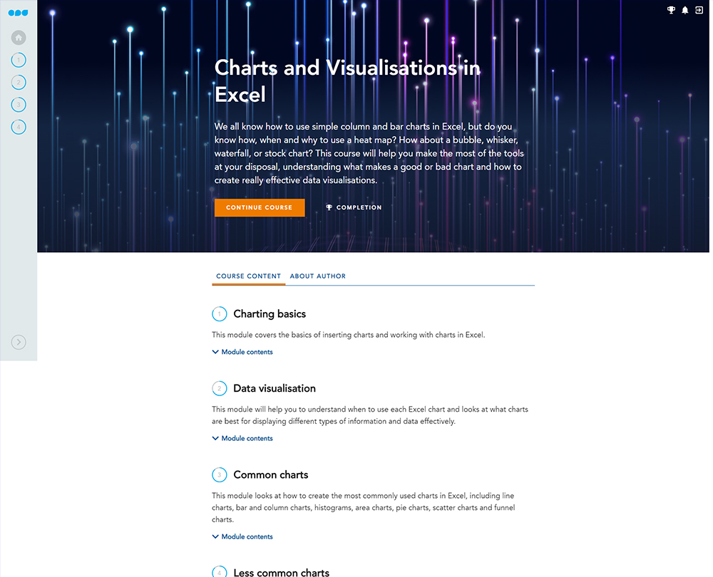
We all know how to use simple column and bar charts in Excel, but do you know how, when and why to use less common charts such as the bubble chart or a heat map? In recent years Microsoft has created a much broader range of charts and visualisations for you to choose from. These new options, along with the classic suite, allow you to tell the story of your data.
This course will enable you to make the most of the tools at your disposal, understanding what makes a good or bad chart and how to create effective data visualisations. From the basics of how to add and amend charts and apply templates to them, through commonly used charts and formatting options, to some of the less common charts that will really mark you out as an expert.
Contents
Charting basics
Quick charts and chart sheets
Quick Analysis handle and Recommended Charts
Using Ideas
Charting ribbons
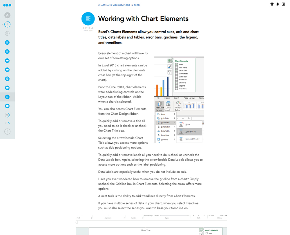
Chart Elements and chart formatting
Working with Chart Elements
Creating custom chart templates
Data visualisation
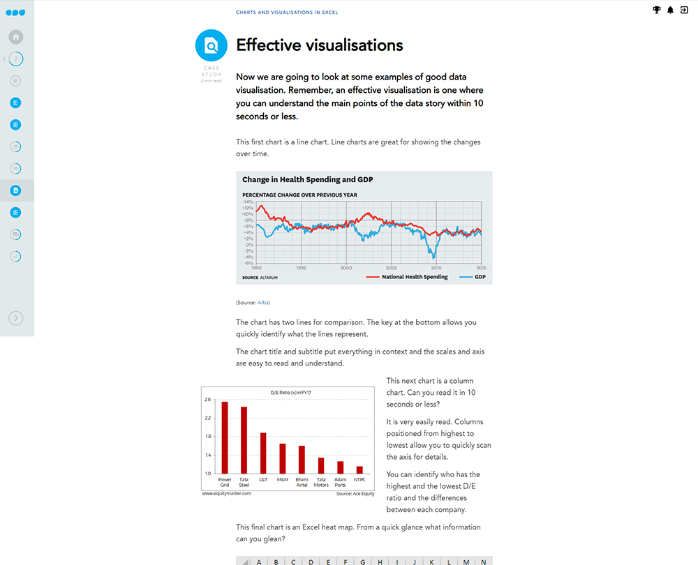
What is data visualisation?
The principles
Choosing the right visualisation
Common charts
Working with line charts and trendlines
Working with bar and column charts
Histograms and Pareto charts
Working with histograms and Pareto charts
Tips for creating area charts
Working with area charts
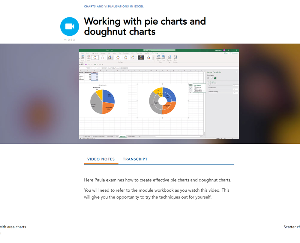
Working with pie charts and doughnut charts
Scatter charts and correlation
Working with scatter charts
Working with funnel charts
Less common charts
How to create a bubble chart
Reading box and whisker charts
Creating a box and whisker chart
Waterfall charts and Excel limitations
Profit and loss waterfall chart
Heat maps and surface area charts
Stock charts
Combo charts
How it works
Author

Paula Guilfoyle
Paula practiced in Industry for over 15 years, working with both small and large private companies, before moving on to teach Excel and Power BI to accountants and professionals.
You might also like
Take a look at some of our bestselling courses