Presenting Numerical Data
Explore how effective use of data can enable informed business decisions and win support for ideas. In this course, you’ll discover how to express numerical data through visuals, analyse and interpret data and create persuasive business presentations.
£100 +VAT

Presenting Numerical Data
£100 +VAT
Presenting Numerical Data
This course is not currently available. To find out more, please get in touch.
This course will enable you to
- Present your data clearly to enable informed business decisions
- Win support for your ideas, by presenting your data in compelling ways
- Analyse data and produce effective forecasts
- Use visual tools to aid the interpretation of data
- Share data effectively using a range of methods
- Use your data to generate persuasive business presentations
About the course
As an accountant you will deal with numbers every day. But how do you communicate numerical data to others? Translating the information you have in a way that makes it accessible to everyone is a key skill. Well-presented and focused data can help you and your colleagues make effective decisions. It can also build support for new initiatives and ideas.
This course demonstrates how best to share and present numerical data to support your individual and organisational goals. You’ll explore how effective use of different types of data can enable informed business decisions and win support for ideas while considering your audience and the wider context. You’ll also discover the importance of analysing data, how to express numerical data through visuals, and how to share your data for persuasion and influence.
Contents
Data presentation in your role
Why is sharing data important?
Why data presentation skills matter
What’s special about presenting data?
Data presentation as a form of communication
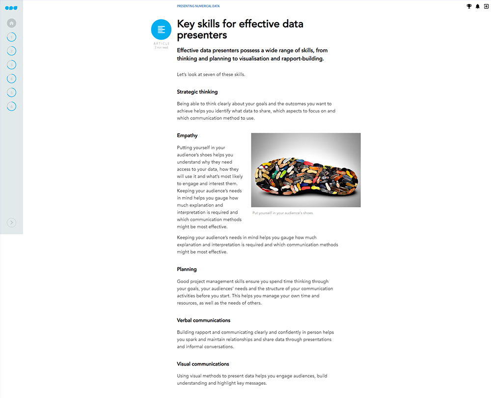
Key skills for effective data presenters
Sharing data with non-specialists
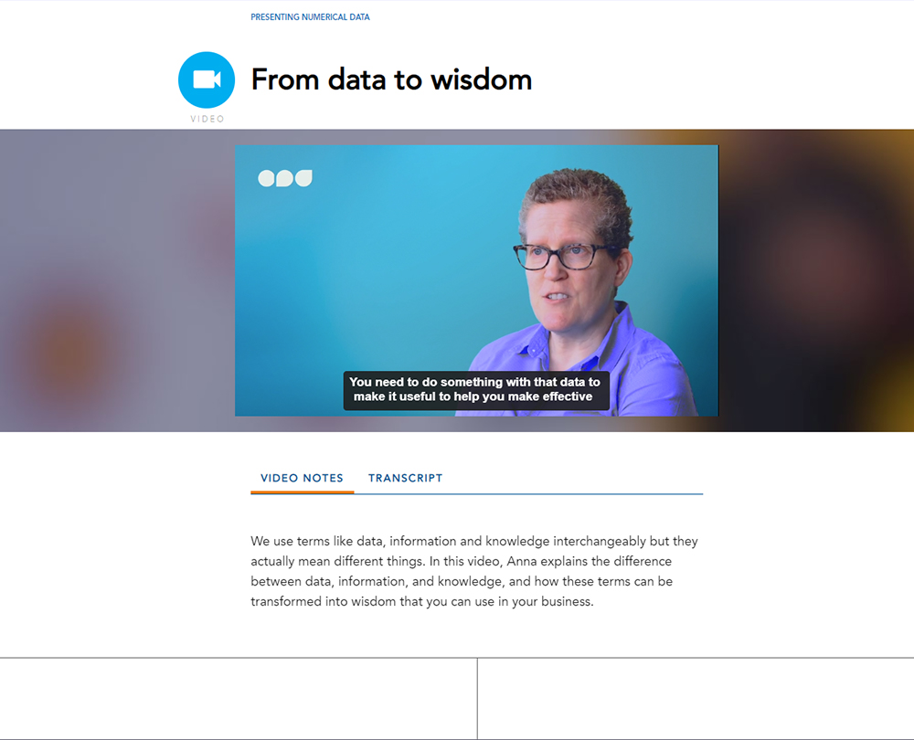
How data leads to knowledge and understanding
From data to wisdom
Types of data
The data pyramid
The data pyramid in practice
Providing insight
Evaluating data
Analysing and explaining data
Before you share data
Analysing data
Forecasting from data
Devil in the detail
Explaining data
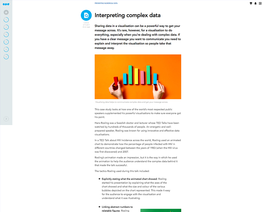
Interpreting and visualising data
Keeping it simple
Using visual tools
Tables vs charts
Misleading charts
The power of colour
Sharing data to inform decisions
Data, facts, and opinions
Making decisions
Sharing data in written documents
Sharing data in a presentation
Designing effective slides
Handling ambiguity and uncertainty
Using data to persuade and influence
Using data to influence
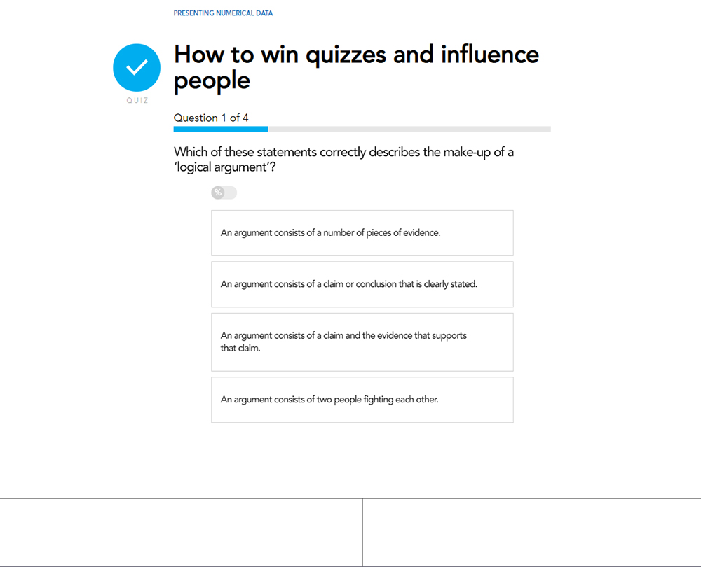
Constructing arguments
Why data isn’t enough to change someone’s mind
Targeting your audiences
Verbal tactics
Telling engaging stories using data
How it works
Author

Anna Faherty
Writer, lecturer and consultant working across the publishing, museum and charity sectors.
You might also like
Take a look at some of our bestselling courses